
1. User testing report
1.1. Introduction
The idea of ‘FoodMood’ was initiated with the understanding of a design challenge of how to use technology to monitor the impact of our eating habits and diets on our mood. For this, we interviewed a lot of people who gave us our initial insights on the design challenge we are trying to solve and what sort of solution will have maximum impact on our target audience.
After conducting our initial interviews, we were able to notice a pattern of common motivations, pain points, and interests of these people. The system goals we decided to tackle with FoodMood are:
Prediction of mood based on your diet
Track diet and mood
Food and mood log simultaneously
Caffeine and water tracking
Water reminders
The key questions that we are trying to answer in our user testing are as following:
How satisfied users are with the current app flow and user interface?
Does FoodMood solve the challenge it was meant to solve?
What problems and pain points users encounter with FoodMood at this stage?
How easy and convenient do users find FoodMood to be?
Our user experience research is about empathizing with our users. What is important to them, what their pain points are, what they feel about a certain problem, how interested they are in solving that problem and what solution they find convenient. Therefore, it is important to test our initial prototypes with our users.
1.2. Methods
Our target audience consisted of people from the age groups of 18-35. Our main focus included people who were too busy to figure things out for themselves and trying to shift to a healthy lifestyle, the ones who were extremely cautious about their choices for their physical and mental wellbeing. Lastly those who were noticing that their diet had an impact on their moods.
We used Hallway or Guerrilla testing as our recruitment method. In which we looked for willing participants who were not existing users of the application. We asked them to perform a certain set of tasks to see how they perform, what was done with ease and which parts of the assignment had been confusing or difficult for the user to execute.
Our first participant for testing, P1, was a 30 year old man who was suffering with kidney stones. To cure his condition he was required to drink a minimum of 2 liters of water everyday but because of work, he often missed drinking water which in turn caused him a lot of pain.
The second participant for our user test was P2. She is a 23 year old fitness model. Her job requires her to maintain a lifestyle that strictly restricts her to food that is healthy. She often feels that the food that she has to eat lacks flavor and good taste.
Lastly we had a 20 years old university student, P3, whose lifestyle living alone in a hostel had forced him to consume excessive amounts of coffee to the point where he cannot go without it.
We designed a set of tasks for our participants to see exactly which parts of our design frustrates people, where they get confused and to get insights on why users do what they do. The task were as follows:
Task 1:
You have just had your dinner and you want to login your food intake.
Task 2:
After logging in your diets for a month you want to track your progress and see how you have progressed.
Task 3:
You want to cook a healthy meal and you don't have ingredients for it. Using FoodMood, find a suitable recipe and order the ingredients that aren’t available.
Task 4:
You have just drank two glasses of water and you want to add it on the water tracker of FoodMood
2. Findings and Recommendations
The task completion rate was fine. Only one participant failed in one task, while all the other participants were able to complete all the tasks. However, the high level reactions of the participants looked as if they were confused in the middle of the task. For example, participant#2 said that there are no navigation buttons, so I don’t know where to click next. In a similar way, participant#1 was confused in logging food. Once he captured the picture of the food, he was immediately asked about how he feels after taking a certain food. Participant#2 thinks it should not have appeared immediately on the screen. Participant#3 suggested that there should have been better context on each screen, about what this screen is displaying the user.
These are the few reactions which suggested that the application needs a little more UI improvement to enhance its user experience.
2.1. Key Findings
2.1.1. Navigation buttons were missing
Evidence:
Severity of problem:
Here, one of the participants commented that there are no navigation buttons, what if I logged in the wrong mood and I have to go back again. This is when we judged the severity of the problem. The participant was able to complete the task but we are only considering the best case scenario. The screens were not prone to users making any mistake at any step. If it happens, the user would have to start the task all over again which would have been a disaster in terms of user experience.
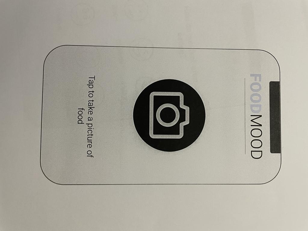
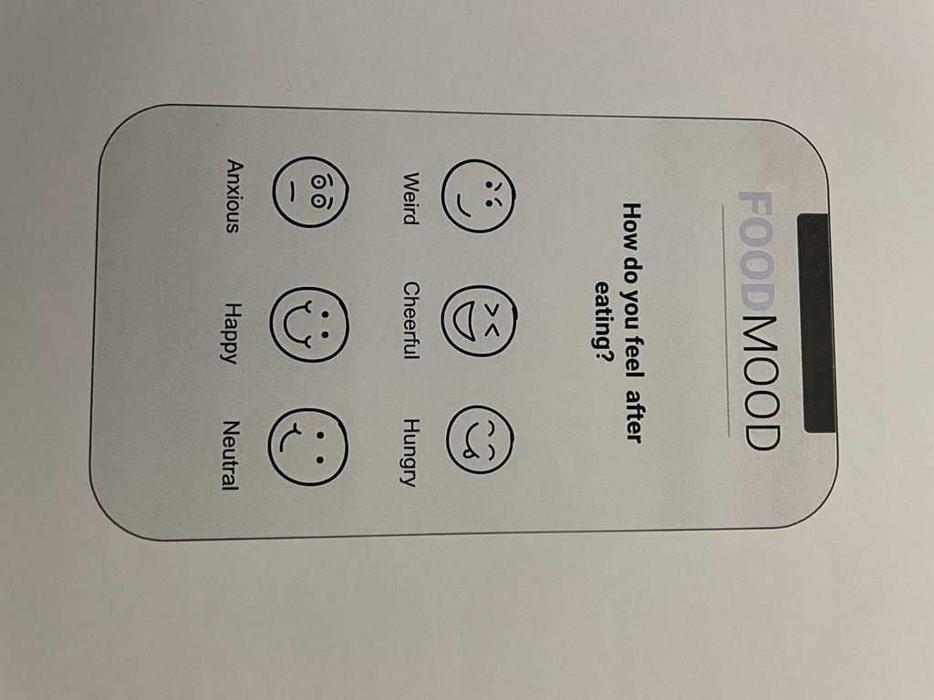
2.1.2. ‘How are you feeling after taking in a food’ screen appears immediately which doesn’t make sense for the user before he has eaten anything
Evidence:
Severity of problem:
No participant commented on this, but while conducting the test, we were able to tell that this is the wrong time for this screen to appear.
A notification about food log should have appeared at this time, to indicate that food has been successfully logged. This is also a critical problem, because a user might never know when he was not able to successfully log a food record.
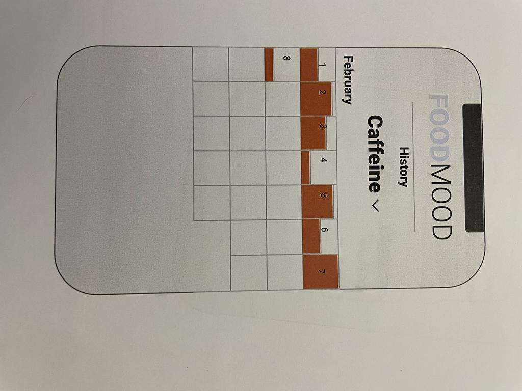
2.1.3. Monthly progress of calories doesn’t provide an accurate guess of how healthy a person has eaten
Evidence:
Severity of problem:
This does not appear as a critical problem to us because this would not lead to a task failure. However, if we improve it it will lead to a better understanding of the progress for the user.
2.1.4. Sign in and continue as guest provides same set of features to the user for now
The application overall gives no motivation to the user to register. The application flow/path for both sign-in and continue as a guest is exactly the same.
Severity of problem:
There should be certain features that are only available to people who have registered for the application. If this is not done, the user will never want to get into the registration process.
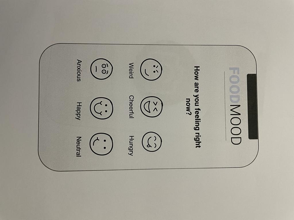
2.1.5. Mood logging before and after taking in food is too generic
Evidence:
Severity of problem:
This is not a critical problem but only a handful of mood options provided to the user might not be enough. More options should be given to the users for better mood tracking.
2.1.6. Homepage only had buttons with ‘water’ and ‘coffee’, participants got confused if it will track progress or show history until they saw ‘History’ button
Evidence:
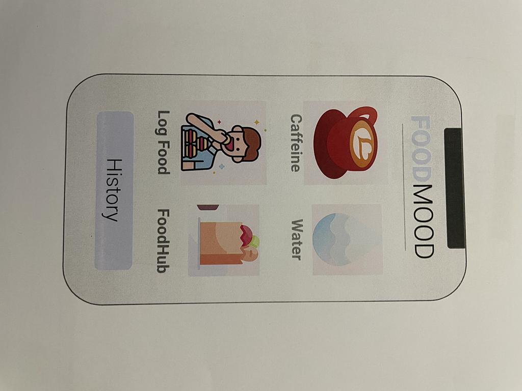
Severity of problem:
A better context of icons and each screen should be given so that the user does not feel lost at any point of time. This is a high severity problem, as we don’t want to confuse the user.
2.2 Recommendations
More robustness in the application
More user control and freedom in a sense that when users make a mistake at any point, they are able to have an ‘emergency exit’. For this, the following UI features are recommended:
Support forward and backward buttons
Show a clear way to exit the current interaction
Navigation buttons are easily discoverable
Confirmation and acknowledgement on Task Completion
A confirmation message should be prompted whenever a user successfully logs food, water or coffee. So that he knows that he was successful in performing a task.
3. Conclusion
After conducting the test, we were able to know where our application lacks. A few important findings like navigation buttons and acknowledgement notifications that we didn’t consider while working on low-fi prototypes were considered after conducting these tests. In the next steps, we would like to improve and work on these minimal lacking in order to provide a better experience to the users.
4. Design principles
The following are the design principles we followed (Nielsen, 1994):
Consistent Design
We have followed a theme of white, black and blue throughout the application with the font style being roboto.

Contrast
We added different types of icons to distinguish between the logging of food and water among many other things to convey that items are different.


Less is more
We placed related elements together

Proximity
Placing value on reducing the operational and cognitive costs of the users, the design’s usability and consistency improved.

5. Flow

6. Video demo
Appendix
Consent Form
I agree to participate in the user test conducted and recorded by ‘Team Utopia’ (Rabbia, Muhid, Khadija, Maryam) of UXE Section A, which is being taught by Dr. Amna Basharat.
Purpose of test
The purpose of this test is to understand how users will interact with the FoodMood application we have designed so that we can adapt to better our user experience and improve the design of the application.
Voice recording permission
We will take handwritten notes and voice record the session. Summary data may be used in publication for educational/research purposes.
By signing this form I declare that I understand and consent to the use and release of your session’s recording by Team Utopia. I understand that the information and recording is for research purposes only and that my information will not be used for any other purpose and will only be viewed by those working on Team Utopia’s UXE course project. I understand that participation in this User Testing study is voluntary and I agree to immediately raise any concerns or areas of discomfort during the interview session with __________________.
Non-disclosure
We may discuss ideas with you or show you designs which are not yet announced. We are doing this so we can get your feedback only. By signing this form, you agree not to tell anyone, including family members, detailed information about this session and about any new designs you observe during this interview. What you can say is that you participated in a study to help improve the application.
Please sign below to indicate that you have read and you understand the information on this form and that any questions you might have about the session have been answered.
Name:
Signature:
User Test Script
Preamble:
Hi, I am ________________ ,
Thank you so much for agreeing to take the test. How are you today? Today we’d like you to help us understand how well our app FoodMood can help people log and track their daily food and water intake. So, we’d like you to do a couple of tasks using the prototypes and collect your feedback. Specifically we’d like to know what you think about them, and what works and doesn’t work for you. Your feedback will help us learn how we can improve the user experience. Before we start, here are several things I’d like you to know. First of all, we’re testing the app but not you. There’s nothing you can do wrong. So don’t worry about making any mistakes. If you cannot get something to work, or you think there’s anything broken or wrong or weird or confusing, it is not your fault but the system’s fault. Please let us know exactly what you think about the app. You can be honest. You won’t hurt anyone’s feelings if you say something bad about it. This is actually why we are bringing you here today to let us know which part of the site doesn’t do a good job. I’ll tell you what tasks to do using the prototypes. After you start, please try to focus on the tasks, but I may ask you a few questions during the test. You can also ask me questions, but I may not be able to answer all of them, because we’re trying to observe what people do when there’s no one sitting next to them. But I’ll try to answer questions you still have when we are done.
As we go along, I’m going to ask you to think aloud, which means that you speak all of your thoughts while you’re using the site, for example: what you’re looking at, what you’re trying to do, what you’re doing and thinking, why you’re doing and thinking that way. If you can’t find a way to complete a task and you think you’re stuck, let me know and you can move on to the next one. For each task you’re asked to do, tell me “I’m done” when you think you are done.
Do you have any questions for me before we begin?
Pre-test interview:
Before we test the prototypes, I’d like to ask you just a few quick questions.
Have you ever used any app to log in your food intake?
Have you ever tried to monitor your food intake?
Did you ever use any app for water logging and reminders?
Do you track what food you eat?
Now I would give you some tasks to perform
Task 1:
You have just had your dinner and you want to login your food intake.
Task 2:
After logging in your diets for a month you want to track your progress and see how you have progressed.
Task 3:
You want to cook a healthy meal and you don't have ingredients for it. Using FoodMood, find a suitable recipe and order the ingredients that aren’t available.
Task 4:
Record how you are feeling before and after the meal in the app.
Post-Test Questionnaire
What is your overall impression of Food Mood?
Have you ever used any similar application; which ones? And how was your experience with them?
Do you think that Food Mood would be useful for you personally?
If yes: then how might you use it?
How usually do you manage the above mentioned task otherwise?
How often do you think your water intake is neglected because of work?
Do you find it hard to find ingredients for something you're planning to cook?
If no: whom would you think might be a better suitor for the app?
What do you like best about Food Mood?
Which aspect of the application do you think could be improved?
Team Dynamics
All activities in the ideation phase were done together as a team.
Muhid Abid: Mid-fi Prototype
Rabbia Sajjad: User Testing Report
Khadija Bashir: Mid-fi Prototype
Maryam Zaheer: User Testing Report